How Does the Three-Color Rule Work in Men’s Style?
What Is the Three-Color Rule?
The three-color rule is a guideline in menswear that says your outfit should contain no more than three distinct colors at a time.
That includes everything from your shirt and pants to accessories like watches or bags. If you’re wearing it, it counts.
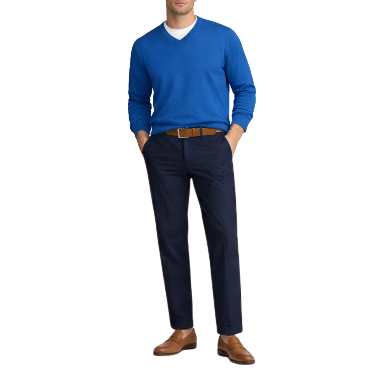
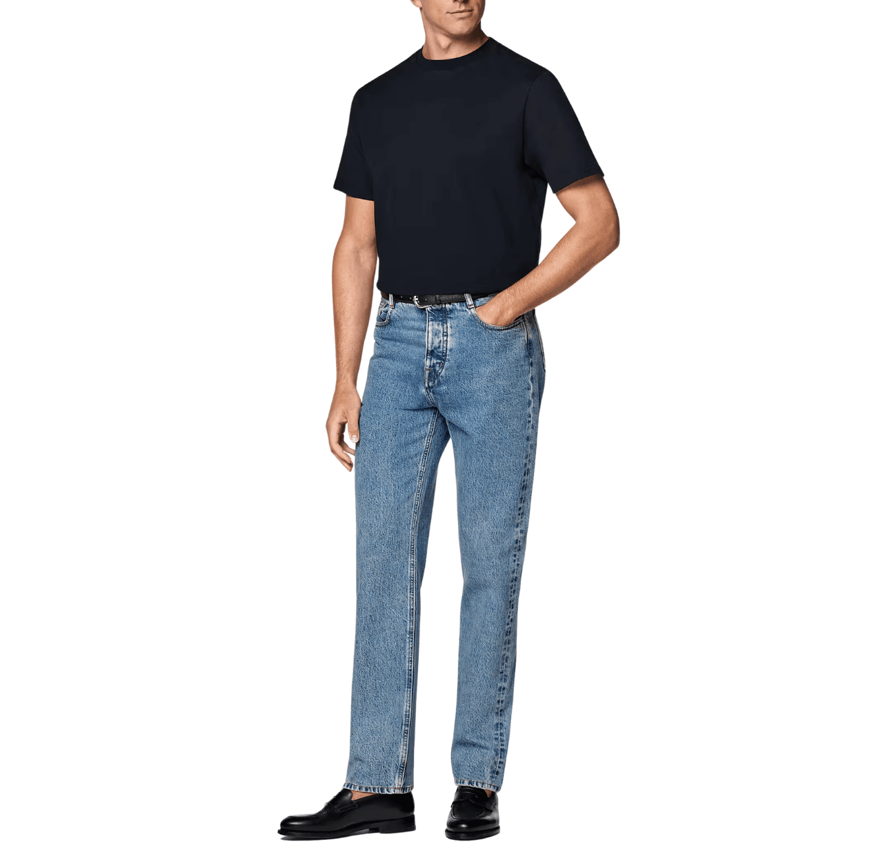
For example: a white tee + navy chinos + tan loafers and belt. Three colors, clean and crisp.

But can you add more items if you’re already wearing three colors?
Yep, you can.
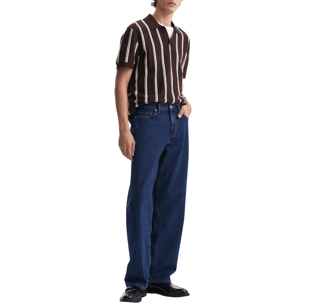
Let’s add an ocean blue V-neck sweater to the outfit above.
Now it looks like there are four colors, right? White, navy, tan, and ocean blue. But it’s still three, because ocean blue and navy are just different shades of blue.
This is where a lot of people get tripped up: shades vs. colors.
A shade is just a lighter or darker version of a color. In the “three-color rule,” we only count the distinct color families, not individual shades.
So, in the example above, the three distinct colors are: blue, white, and tan.
- Ocean blue and navy → both from the same color family (blue)
- Tan → the tan color family
- White → the white color family
Here are ten of the most common color families in menswear and their typical shades.
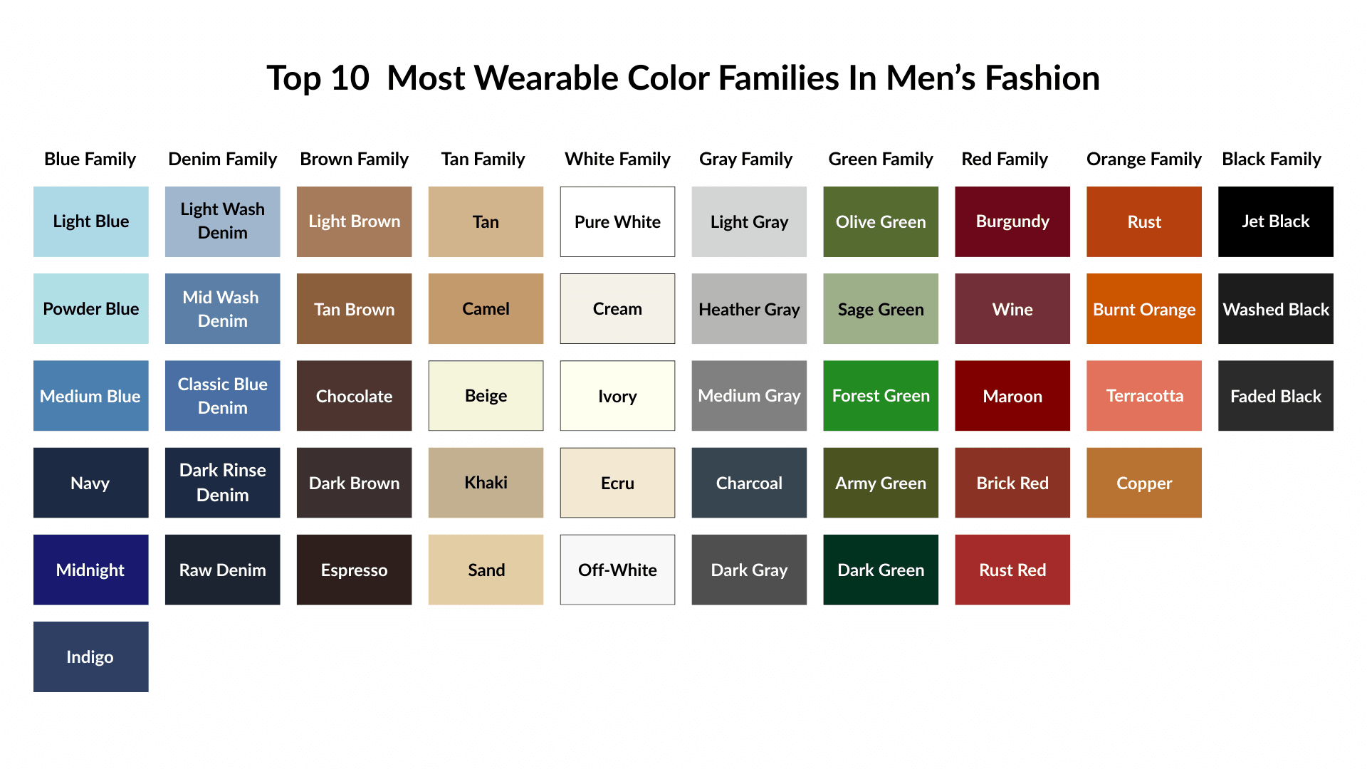
There are a lot of colors you can wear in menswear, but these are probably the 10 color families you’ll see most often.
1. Blue Family: Blue is the most common color family in men’s fashion.
2. Denim / Indigo Family: Technically part of the blue family, but denim is so common in menswear that it acts like its own color family when styling outfits.
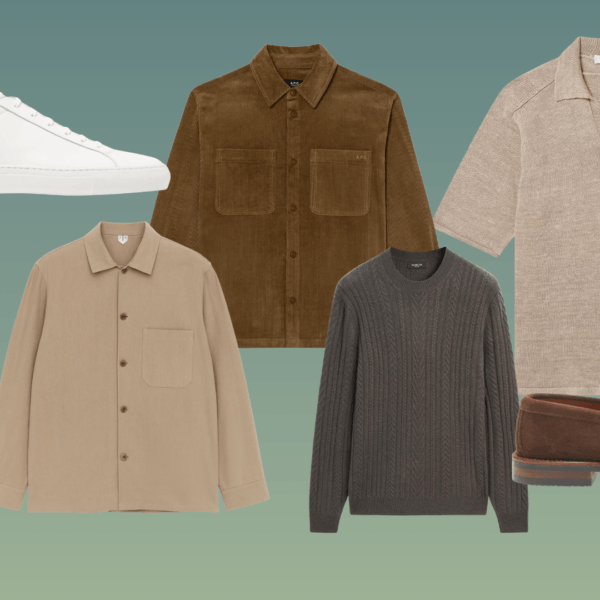
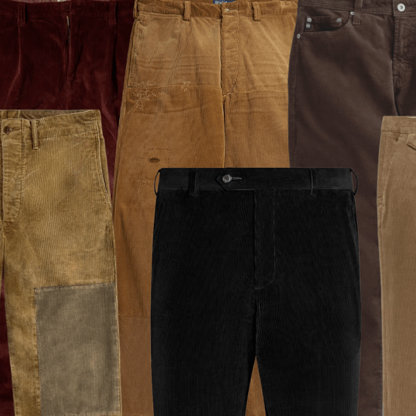
3. Brown Family: Brown is trending in menswear right now because it’s versatile and understated.
4. Tan / Beige Family (Light Browns): Tan is technically a light brown. But in styling, it’s often treated as a separate tone to create contrast with darker browns.
5. White Family: One of the most versatile color families. It can be used as the dominant color, supporting color, or even accent color to brighten and balance darker palettes.
6. Gray Family: Gray bridges warm and cool color palettes. Works great with black, white, and olive green.
7. Green Family: Olive is the most wearable and popular green in menswear.
8. Burgundy / Red Family: Usually used as an accent color, sometimes as a supporting color, rarely as the dominant color.
9. Rust / Earthy Orange Family: A strong fall color.
10. Black Family: Black is foundational. It usually works as a dominant or supporting color.
Understanding Color Hierarchy
In the section above, I said red is usually used as an accent color, sometimes as a supporting color, rarely as the dominant color.
So, what do “dominant”, “supporting”, and “accent” mean?
In the three-color rule, you don’t wear three colors in equal amounts, like one-third each. You wear them in different amounts.
The most common breakdown is 60–30–10: 60% of one color (the dominant), 30% of a second color (the supporting), and 10% of a third (the accent). This is called a color hierarchy.
Here’s how it works in your outfit:
The dominant color (also known as the base color) covers most of your outfit. Usually, it’s your pants, suit, or outerwear.
The supporting color (or the secondary color) usually takes up around 30% of the outfit. Think T-shirts, shirts, sweaters, or second layers.
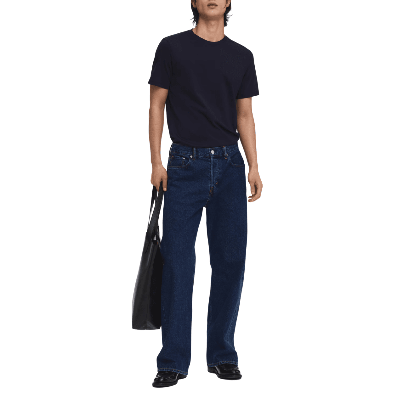
It can complement your dominant color. For example, dark-rinse jeans (dominant) with a navy crewneck T-shirt (supporting).
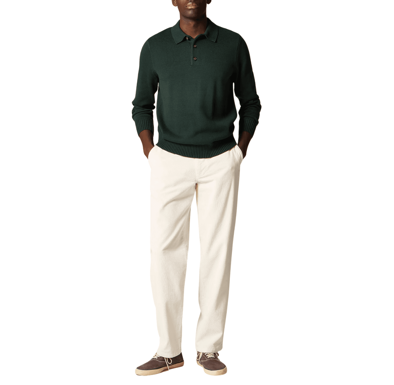
Or it can create contrast with your dominant color. For example, cream corduroy pants (dominant) with a dark green polo (supporting).
The accent color is where you add the pop of color. It’s mostly used for accessories like shoes, hats, bags, belts, or watch straps.
It’s the smallest portion of your outfit, taking up around 10%, but it’s where you can add a bit more visual interest. For example, a burgundy shoe, an olive cap, a rust bag.
Color Basics You Need to Know
Color harmony and hierarchy are the two main aspects of the three-color rule. If you understand them, you’ll rarely go wrong with your color choices.
We’ve already covered color hierarchy. Next comes color harmony. But before we get there, you need to understand a few basic color concepts: neutrals, color temperature, and color context. Color harmony is built on these ideas.
I’ll use the colors and shades from the “Top 10 Most Wearable Color Families in Men’s Fashion” listed above to explain them.
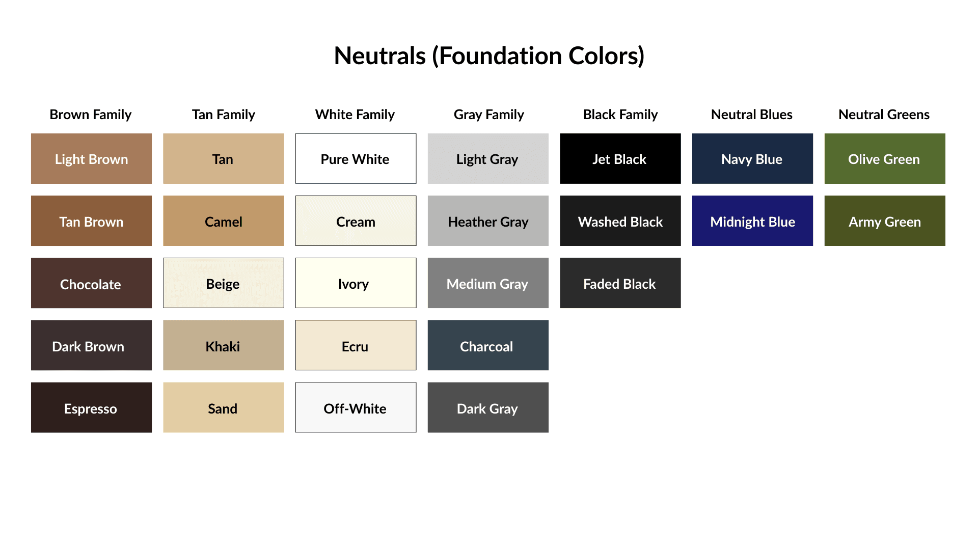
1. Neutrals (Foundation Colors)
So what are neutrals?
Neutrals are muted, low-saturation colors such as white, black, gray, and brown.Because they aren’t vibrant or intense, they won’t create visual noise, so you can wear them in large amounts.
In other words, you can wear them as your dominant or supporting color. And that’s what most people do.
Some of the most stylish men’s wardrobes are built almost entirely around neutrals.
Here are the neutrals you should know:
Neutrals are like the backbone of the three-color rule. When two of the three colors are neutrals, it’s almost impossible to go wrong.
Neutrals are like the backbone of the three-color rule. When two of the three colors are neutrals, it’s almost impossible to go wrong.
2. Color Temperature (Warm Colors vs. Cool Colors)
Almost all colors can be divided into two camps: warm and cool (even some neutrals).
Some colors are easy to spot. For example, burnt orange is clearly warm at first glance. And navy is clearly cool.
But some colors aren’t obvious. Even different shades of the same color can lean warm or cool. For example, olive green is warm, and dark green is cool.
So how do you tell them apart?
You need to look at the color’s undertone.
Warm colors carry warm, earthy undertones like red, orange, or yellow.
While cool colors carry cool blue or blue-green undertones.
There are many techniques for identifying a color’s undertone, but some require deeper color theory, so we won’t get into them here.
Here’s an easy, foolproof method:
Let’s say you have a white tee, and you want to know if it’s a warm white (such as cream white) or a cool white (such as icy white).
Place your tee against a sheet of pure white printer paper in natural daylight (not under artificial light, otherwise you won’t be able to see the true undertone). You should be able to see the undertone.
If your tee is cream white, it’ll look warm orange or yellow.
If your tee is icy white, you should be able to see cool, icy blue.
This method isn’t perfectly accurate, but it’s easy and efficient for everyday use.
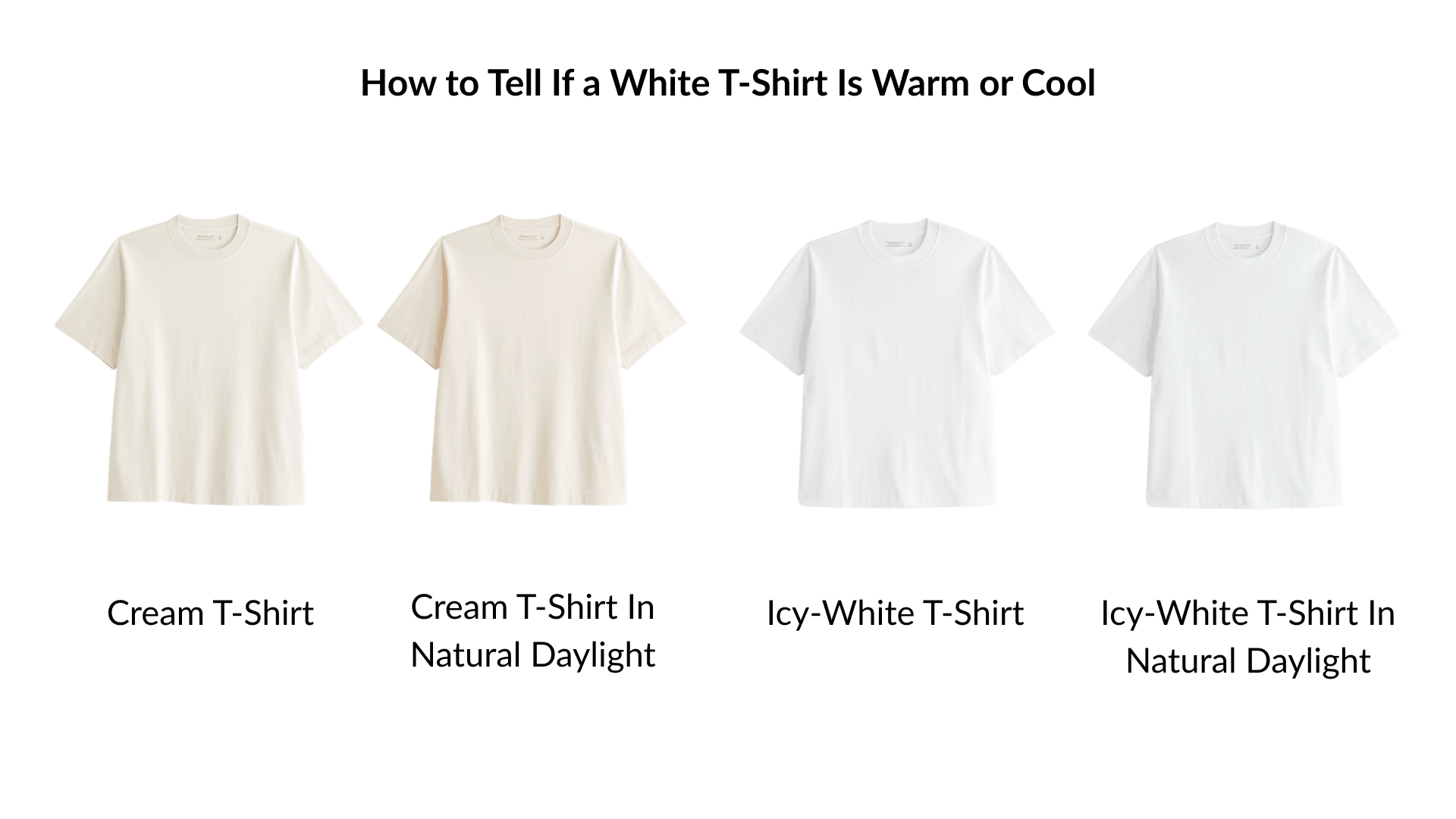
If your tee is cream white, it’ll look warm orange or yellow.
If your tee is icy white, you should be able to see cool, icy blue.
This method isn’t perfectly accurate, but it’s easy and efficient for everyday use.
Okay, let’s look at some warm and cool colors and their shades.
1) Warm Colors and Their Shades (Earth-Based)
Warm colors are best suited for spring and autumn, though they definitely work for summer and winter too.
Here are some warm colors and their shades:
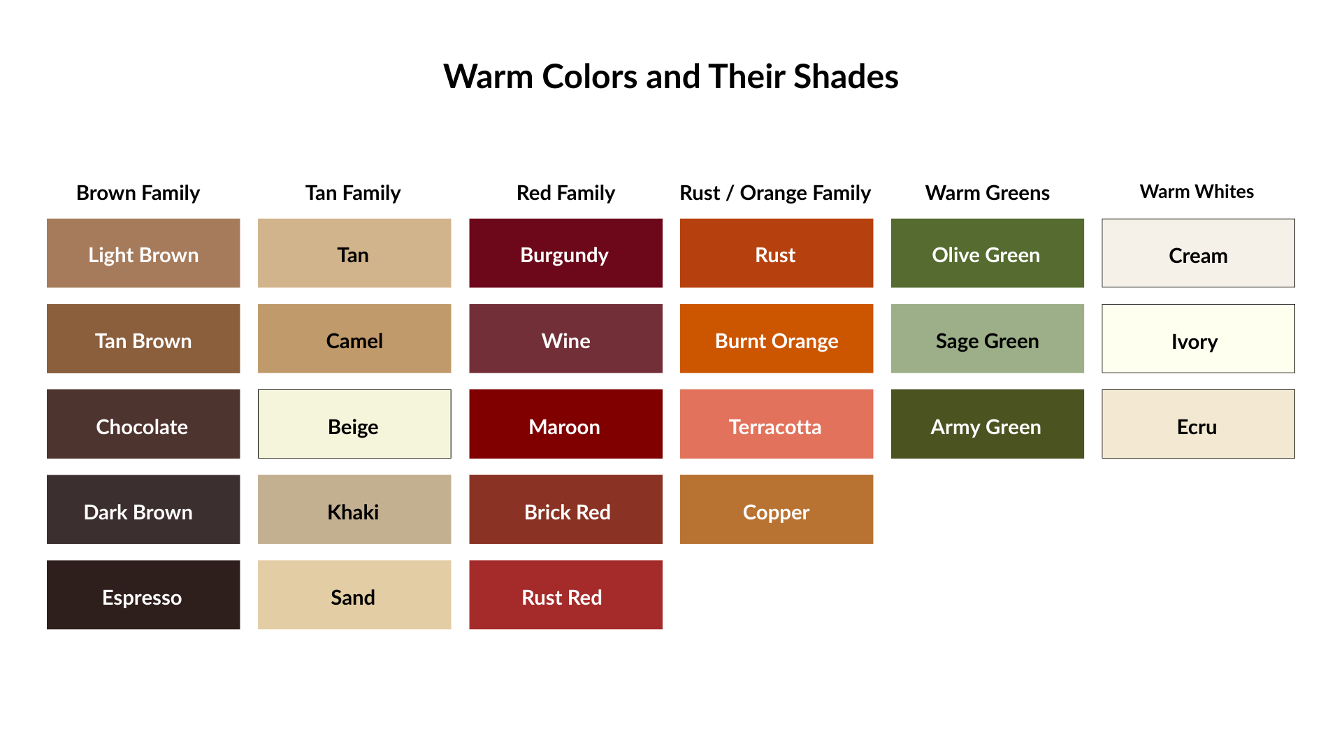
Warm colors can be worn as dominant, supporting, or accent colors. And they pair best with other warm tones or clean neutrals like black and white.
2) Cool Colors and Their Shades
People often wear cool colors in warm weather like spring and summer because of that fresh, cool vibe, and that’s not wrong.
You can also wear them in cold weather, like autumn and winter, but you do need to be careful about color context, which we’ll cover soon.
In simple terms: wear muted cool colors like light blue in warm weather, and sharper ones like navy in colder weather.
Here are some cool colors and their shades:
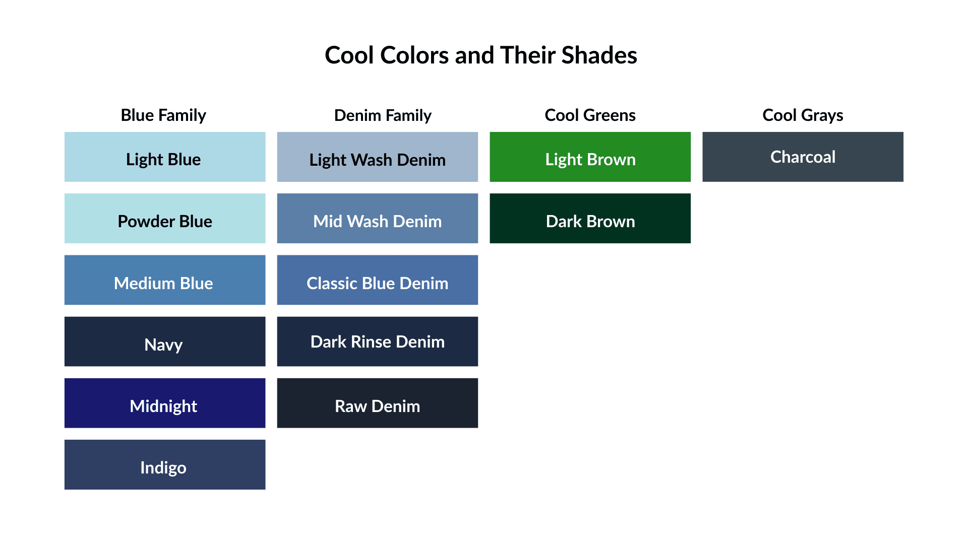
Cool colors can also be worn as dominant, supporting, or accent colors. They pair well with other cool tones and with neutrals like black and white.
3. Color Context/Contrast (Muted Colors vs. Sharp Colors)
Just like colors can be warm or cool, they can also be muted or sharp.
Muted colors are soft, dusty, and look a bit grayish. And the sharp colors are bright and rich.
Some colors are easy to tell. For example, dusty rose is muted, and cobalt blue is sharp. You can just tell at a glance.
But some colors are hard to tell, so designers and artists use design software to measure their saturation and contrast levels to tell if a color is muted or sharp.
But that’s not for everyone. Here’s an easy way:
Let’s say you have a green hoodie, but you can’t tell if it’s sharp green, or muted green.
Place it against or next to something obviously bright and clear in natural light. For example, a bright red fabric.
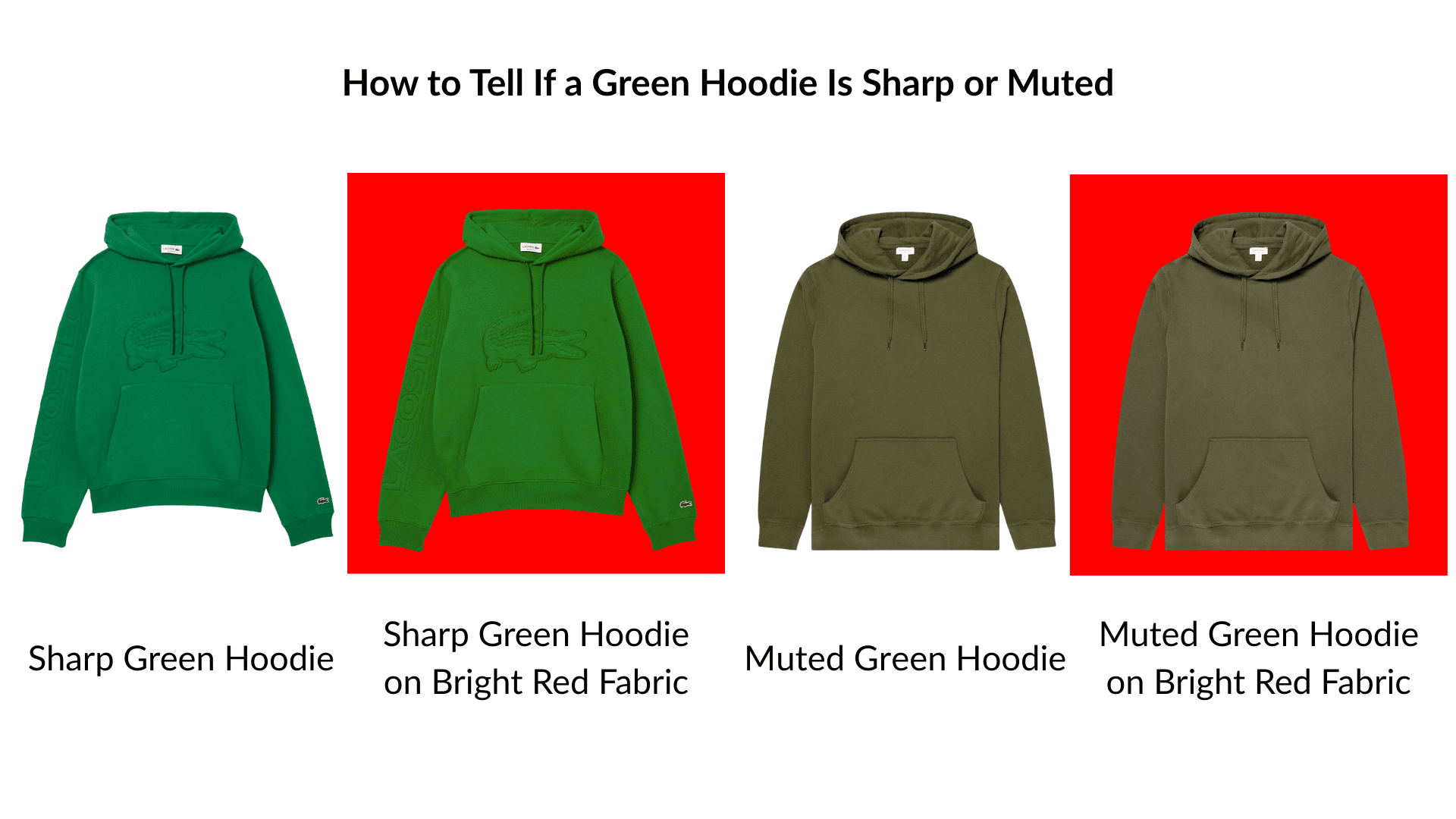
If your hoodie becomes sharper, brighter, and more vibrant, it’s sharp green.
If your hoodie looks softer, slightly dusty, and less vibrant, it’s muted green.
Like the temperature method, this isn’t scientifically precise, but it’s quick and practical for everyday use.
Now let’s look at some muted and sharp colors from the list.
1) Muted Colors and Their Shades
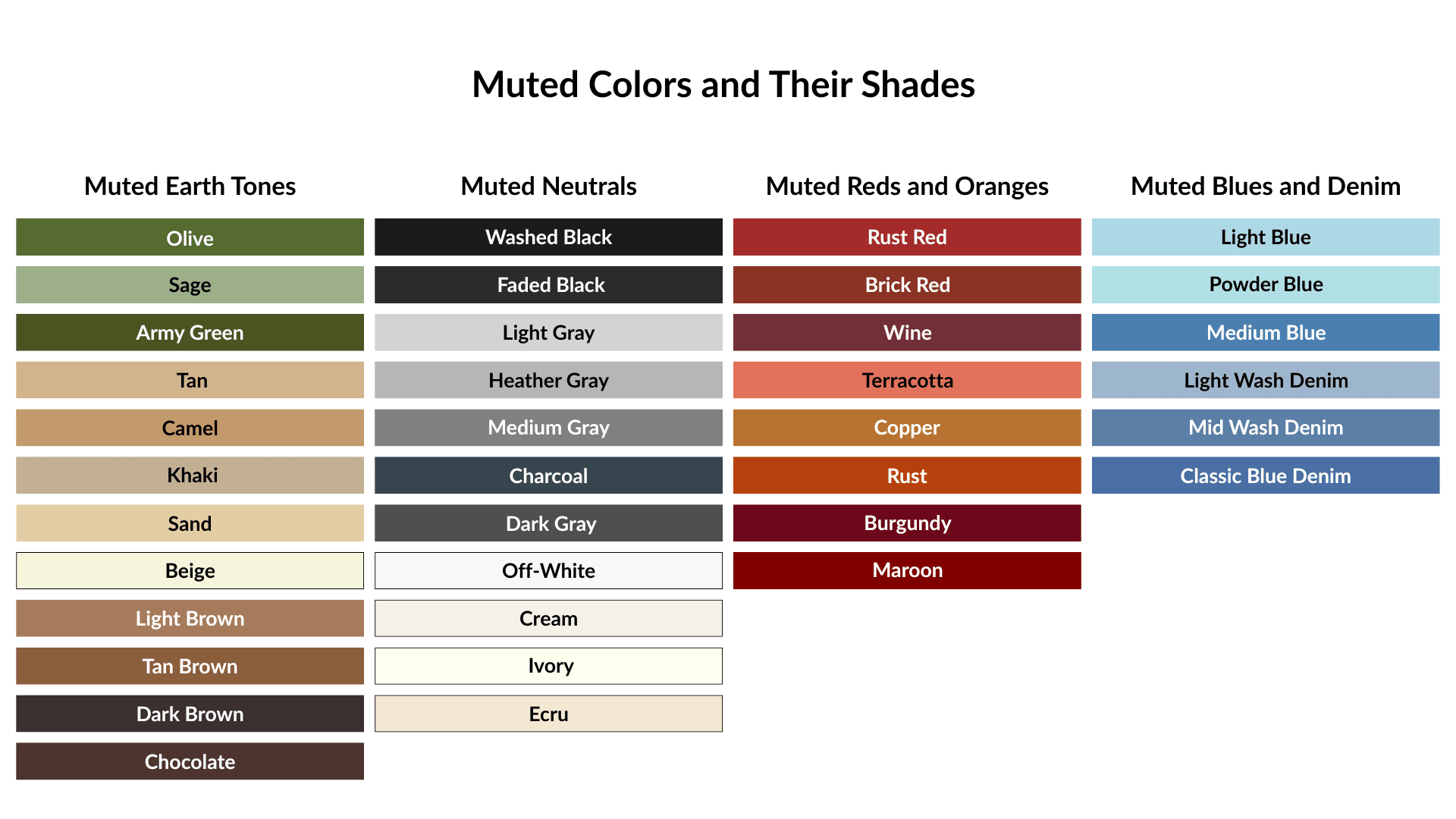
Muted colors are where most of the menswear lives. They’re mostly worn as dominant and supporting colors.
2) Sharp, High-Contrast Colors and Their Shades
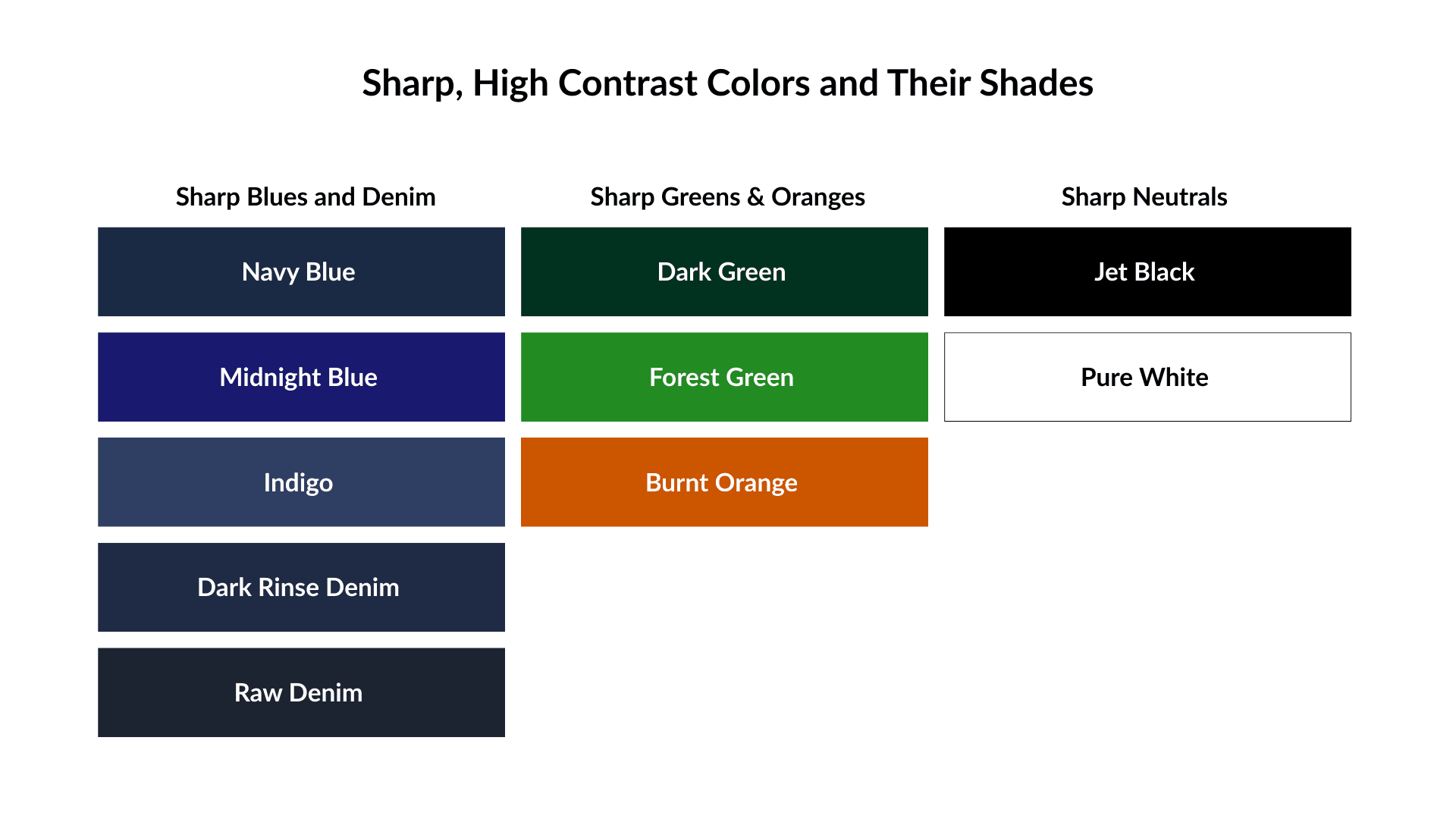
Sharp colors are bright and create a strong visual tension, so you need to use them carefully.
The best case is using them as accents or small supporting elements (except the sharp neutrals).
If you use them as dominant colors, make sure you have a strong understanding of color theory.
The 3-Step Color Harmony Formula
I assume you’ve read and understood color theory.
Now let’s build color-harmonized outfits using them.
Step 1. Choose Your Dominant Color (60%)
Start with the largest piece you wear. Usually, your jacket or coat, suit, or trousers.
The best options for your dominant color are neutrals (whether it’s muted or sharp) and muted earth tones such as black, gray, brown, tan, and olive.
Why?
Because these tones don’t compete or create visual tension. They’re understated and easy to pair with other colors. They can act as a blank canvas for a pop of bright, sharp, or high-contrast colors, adding visual interest to your outfit.
Step 2. Choose Your Supporting Color (30%)
Your supporting color should do either of these two things: complement your dominant color or create a contrast with your dominant color.
1. Complement the Dominant Color
There are two ways to complement your dominant color:
1) Choose the different shades of the same color.
Using different shades of the same color is a common and efficient styling method called ‘monochromatic’ or ‘analogous.’ And it still works within the three-color rule.
For example:
Chocolate brown pants (dominant) + dark brown tee (supporting).
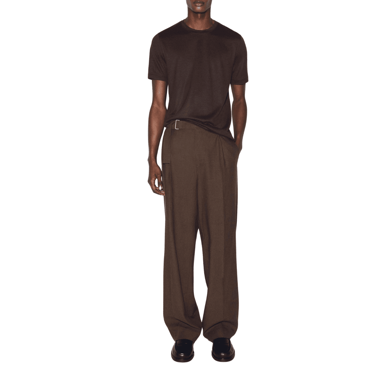
Chocolate brown and dark brown are different shades of the same color — brown.
Or sand wide-leg pants (dominant) + white crew-neck sweater.
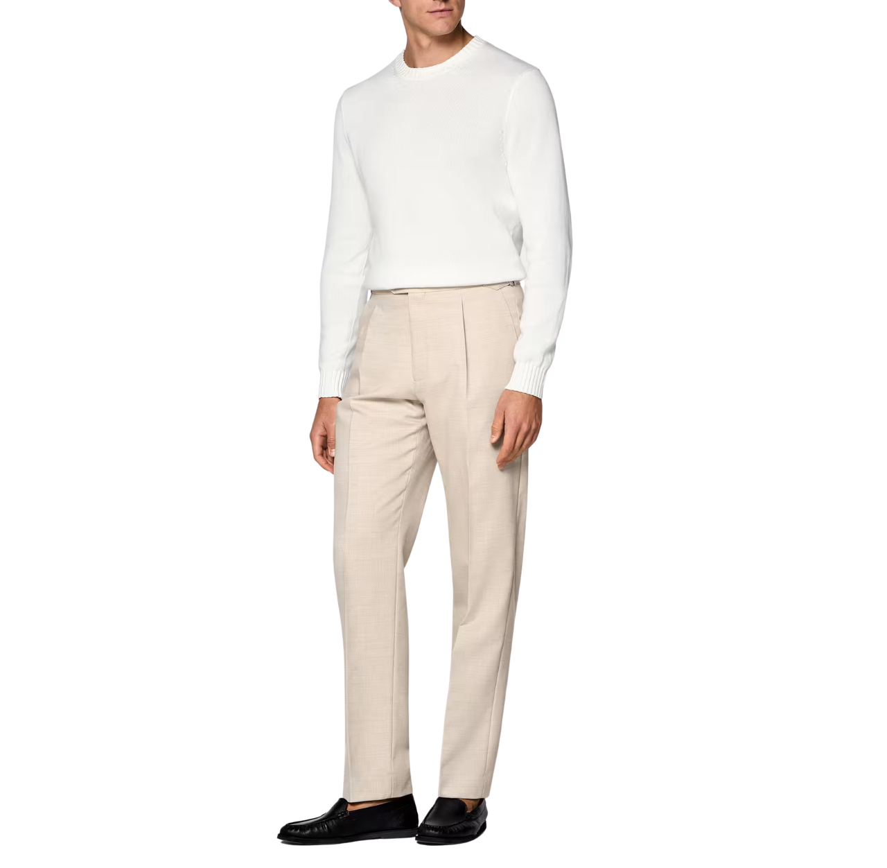
Sand and white are the different shades of the same color — white.
2) Choose the colors that share undertones with your dominant color.
If your dominant color is warm, then choose a warm supporting color.
If your dominant color is cool, then go with a cool supporting color.
If your dominant color is neutral, you can go with either warm or cool colors.
For example:
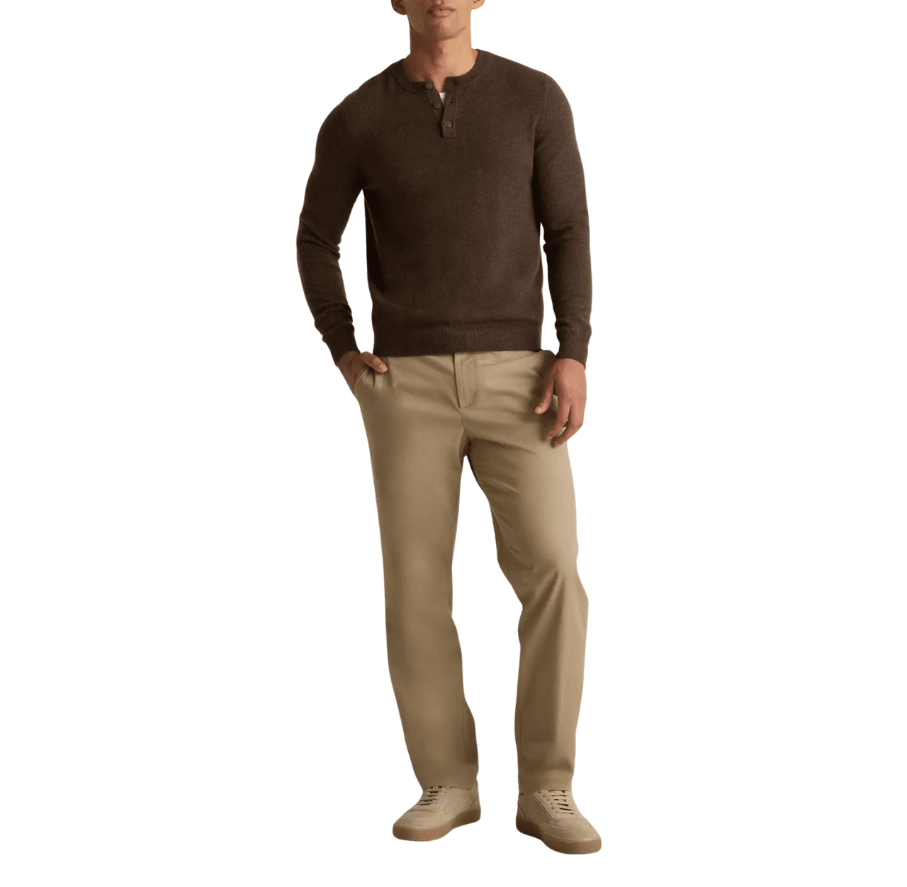
Warm + warm: khaki chinos (dominant) + brown henley (supporting)
Cool + cool: Blue jeans (dominant) + navy T-shirt (supporting)
2. Create Contrast With the Dominant Color
Here are also two ways to create contrast: clear and sharp contrast, or gentle contrast.
1) Create Clear Contrast
To create a clear contrast with your dominant color, the best option is to choose high-contrast neutrals, like pure black or pure white, as a supporting color.
For example:
Black pants (dominant) + white T-shirt (supporting)
Or white pants (dominant) + black T-shirt (supporting)
2) Create Gentle Contrast
For gentle contrast, choose a color in the opposite temperature of your dominant color, such as arm dominant color + cool supporting color, or cool dominant color + warm supporting color. But make sure they’re both muted colors.
For example:
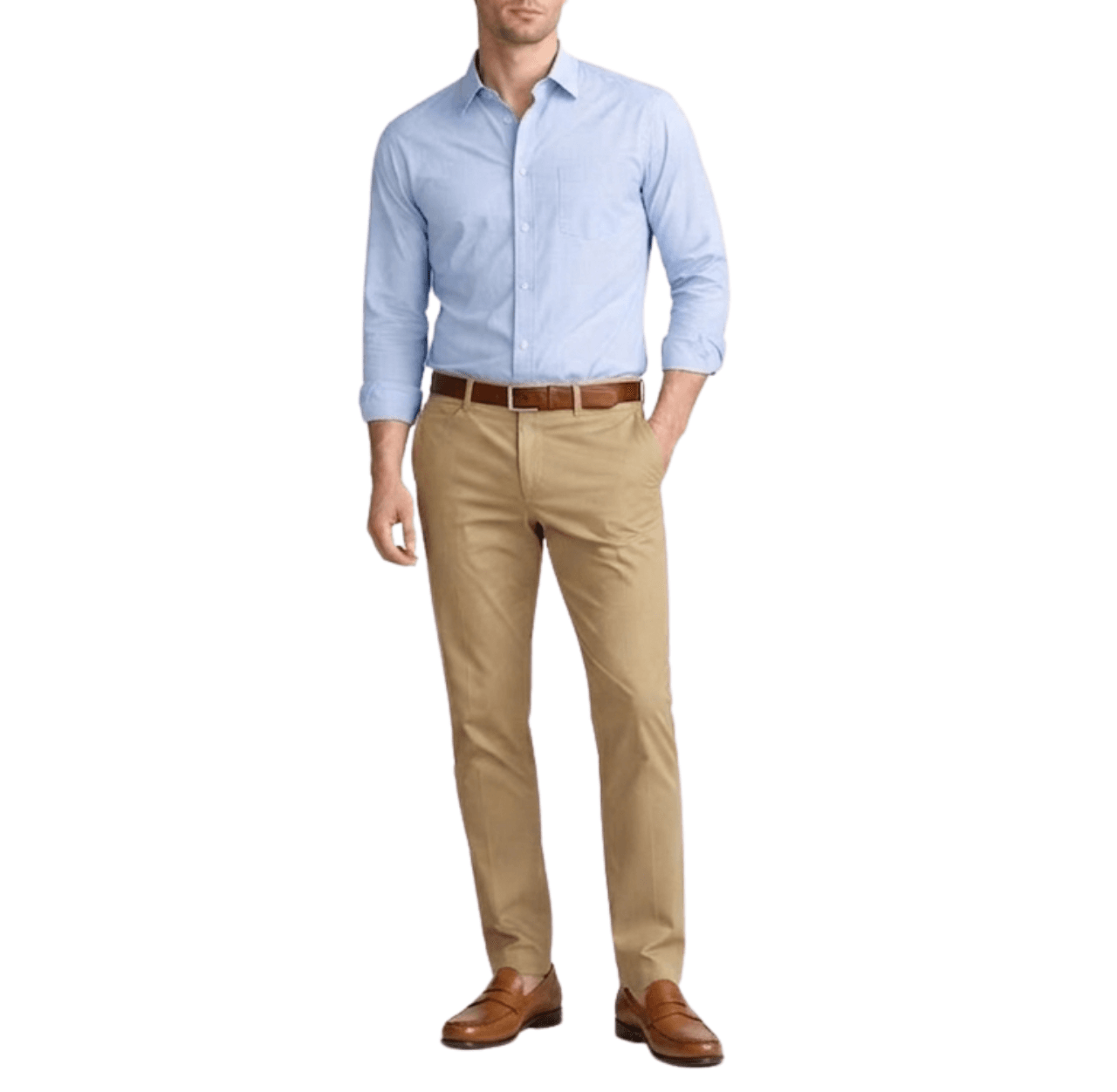
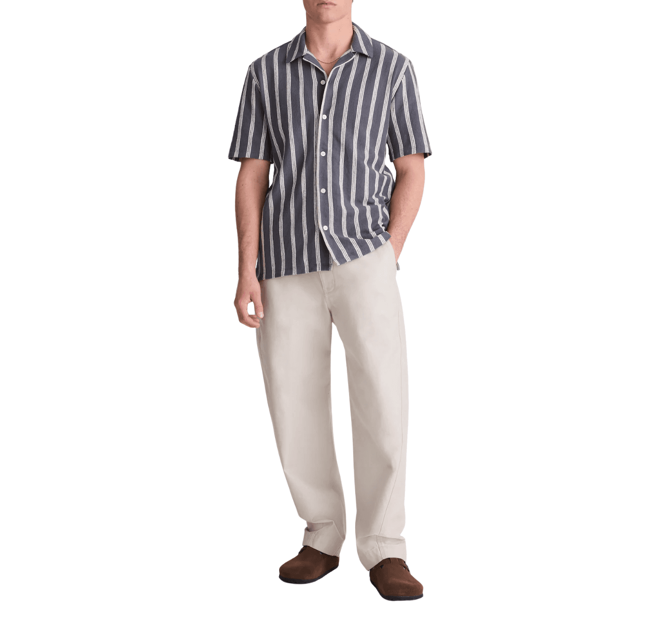
Khaki chinos (warm dominant) + light blue Oxford (cool supporting)
Dark denim blue jeans (cool dominant) + brown striped knit polo (warm supporting)
Step 3. Choose Your Accent Color (10%)
Accent colors are small but powerful; they’re the finishing touch of your outfit.
Usually, your shoes, belt, hat, bag, jewelry, the logo on your hoodie, the decoration on your knitwear, or even the patch pocket on your shirt are accents.
Your accent should do one of two things:
1. Deepen the palette
For example:
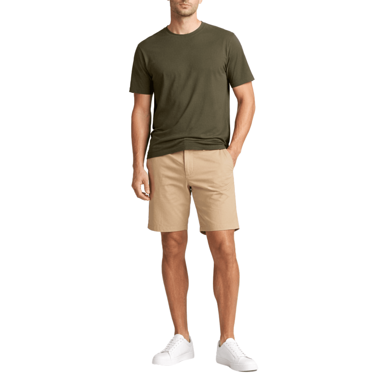
Khaki chinos (dominant) + blue Oxford (supporting) + tan loafers and belt (accents)
2. Brighten the palette
For example:
Olive tee (dominant) + Khaki shorts (supporting) + white sneakers (accent)
Accent colors should create a clear contrast without overwhelming the outfit.
Pro Styling Tips That Take the Rule Further
These are nuances people rarely talk about, but they make a big difference.
Repeat Colors for Rhythm
This is the easiest way to create harmony.
For example, if white appears in your shirt, let it echo in your sneakers. If brown shows up in your boots, repeat it in your belt or bag.
Match Your Leather Tones
Keep your leather goods in similar colors. Not necessarily the exact same shade, but within the same color family.
Brown shoes + black belt = visual noise.
Use Texture Instead of Adding More Color
Want to make an outfit more interesting? Add a textured layer within the same color family.
For example, a ribbed knit sweater in the same shade as your shirt, or a woven cap in a similar neutral shade. Texture adds interest without causing visual tension or complicating the palette.
Layering Distributes Color Intentionally
When you layer, you’re distributing where each color appears.
For example, a navy overshirt open over a white tee + khaki pants = three colors, perfectly distributed from top to bottom. That visual flow feels intentional.
Do Patterns and Prints Break the Rule?
All the examples above use pure colors, but in daily life, we don’t only wear pure colors. We wear clothes with patterns and prints.
So, the question is: do patterns and prints break the three-color rule?
Short answer: No, they don’t. But they take a little more thought.
Here’s how:
Treat the Pattern as One Color Slot
If you’re wearing a striped shirt, it doesn’t count as two separate colors. It counts as one piece. So the colors in your pants and shoes should match the dominant colors in the pattern, and your palette should still stay within three colors.
For example: a navy and white striped shirt + cream pants + brown shoes.
That’s clean. The shirt brings navy and white, the pants pick up the white, and the shoes add brown. Three colors. Done.
Be Careful Mixing Patterns
Mixing patterns is common in menswear, and it looks great when done right.
Let’s say you want to layer a striped shirt and a checked jacket.
First, make sure the stripes and checks are on different scales. That means one should be larger than the other (e.g., a fine stripe under a large check).
Why?
Because when patterns are similar in scale or weight, they compete and create visual tension.
One more thing to keep in mind: if you mix patterns, keep the rest of the outfit clean.
For example: a white T-shirt + a white cotton poplin shirt with navy vertical stripes + a brown-and-navy check overcoat + white chinos + brown suede loafers and belt.
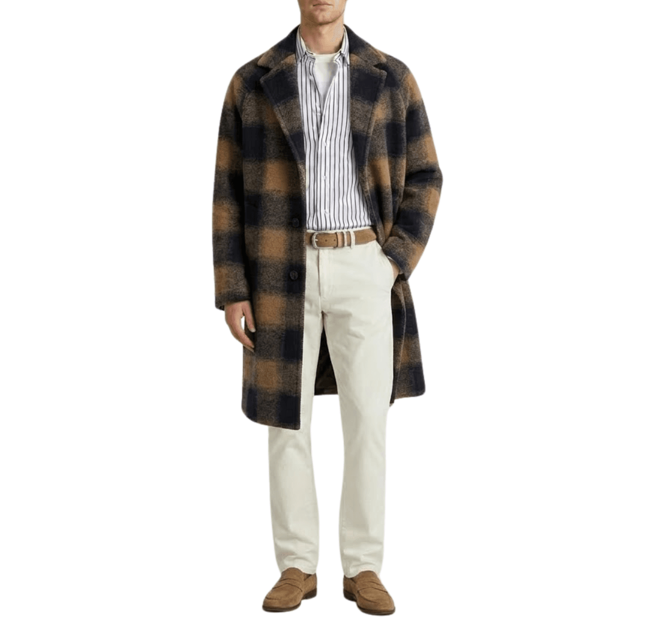
It looks like a lot, but there are still only three colors: white (dominant), brown (supporting), and navy (accent).
Texture Is Not Color
A white knit sweater and a white button-down are the same colors, just different textures.
Mixing textures within the same color is a great way to make an outfit look more interesting.
When to Break the Rule and How to Do It Right?
Now that you’ve learned the rule, let’s talk about how to ‘break’ it.
That’s how fashion works, right? We learn it, master it, and then break it to develop our personal style.
Once you’ve mastered the three-color rule, here are a few ways to go:
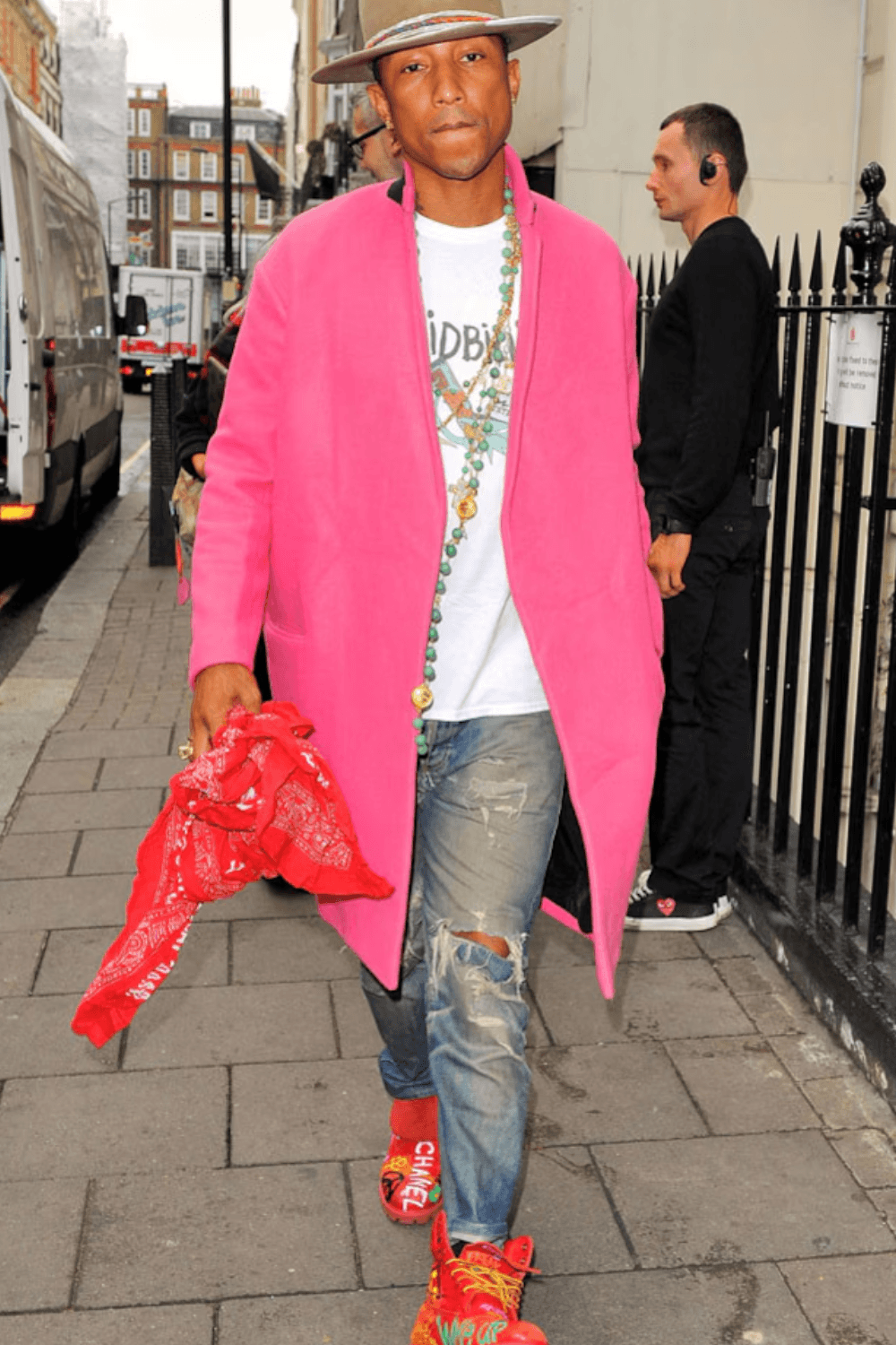
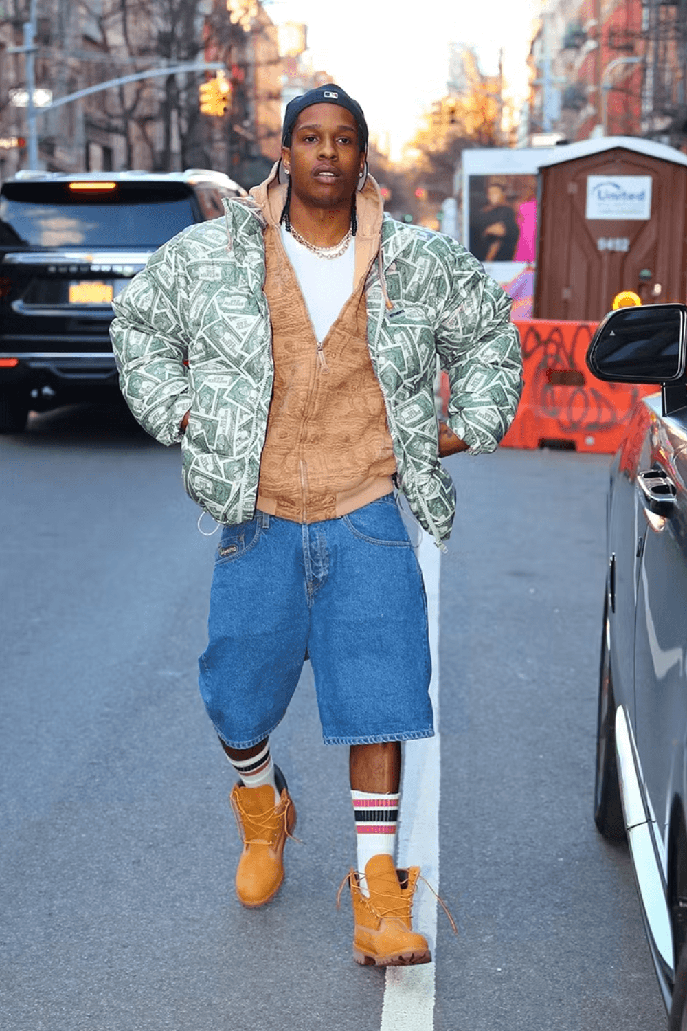
Intentional Maximalism
Some style icons like Pharrell Williams or A$AP Rocky wear four, five, or even six colors at once.
Yet their outfits feel cohesive. That’s because they understand color relationships deeply enough to know which ones can coexist. This is a great intermediate move once you’re comfortable with the basics.
Color Blocking
Color blocking means pairing two or more bold, vibrant colors in large sections. It’s a real fashion technique, but it’s also an adventurous move.
At first glance, it can look like a random mix of bright colors, but it isn’t. Those blocks are built around color harmony. You probably have a basic understanding of it now, but developing a real feel for it takes real-life experience. That’s why color blocking is more of an advanced move.
For example: a multi-paneled rugby shirt + red pants.
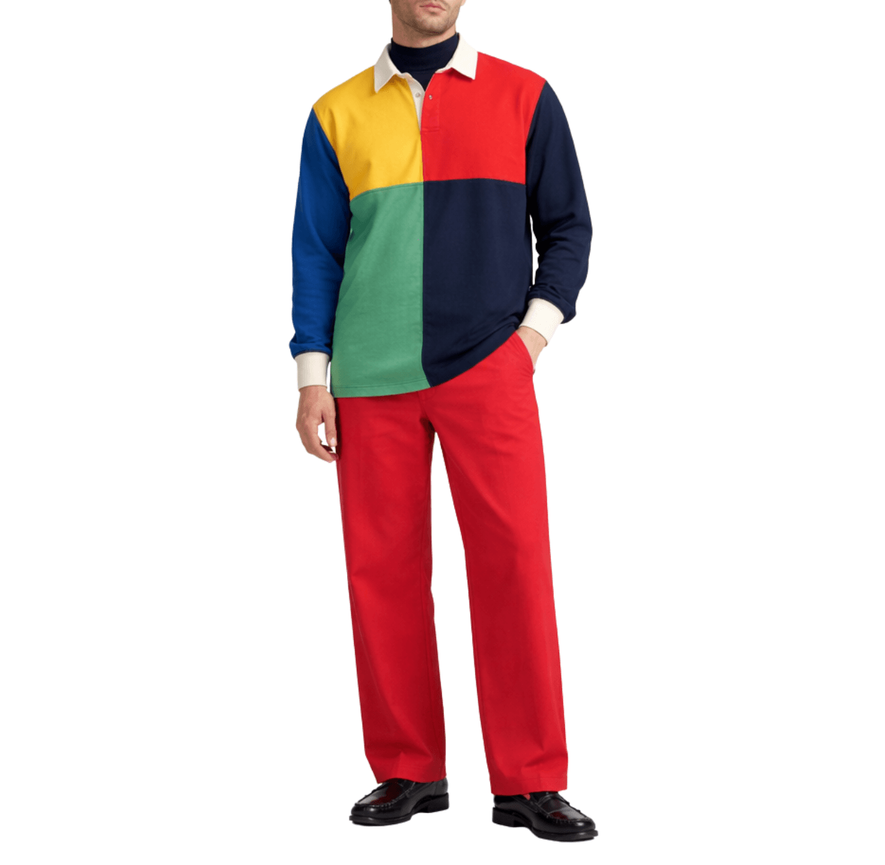
One more thing. Besides color harmony, silhouette and fit are also crucial for color blocking because if the silhouette is off, bold color blocking looks messy and sloppy. If the fit is right, it looks intentional and high-fashion.
Streetwear Layering
Streetwear layering is always bold.
For example: a black baseball cap + a white tee + a gray hoodie + an olive bomber jacket + relaxed black cargo pants + white sneakers + red socks.
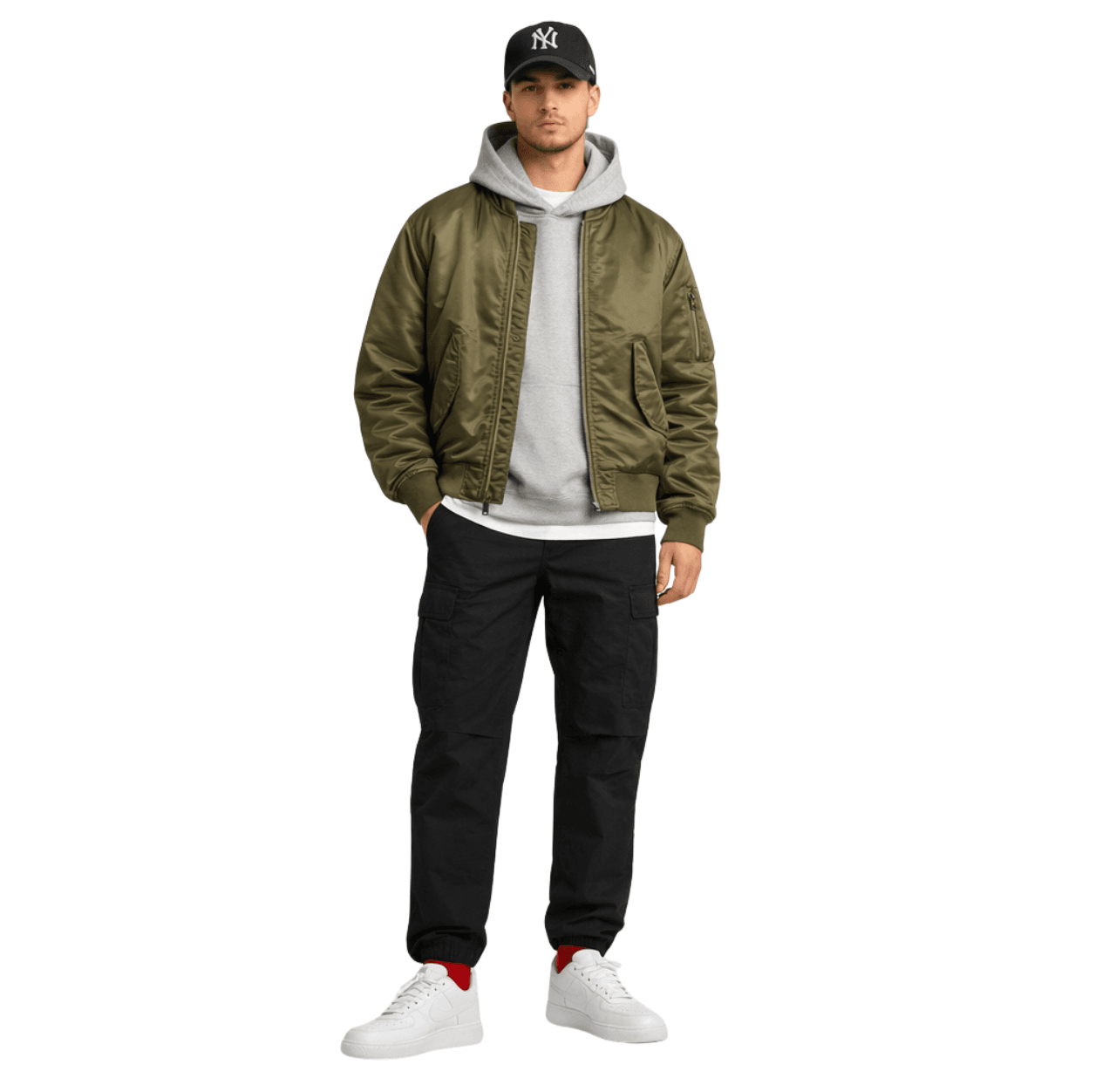
But here’s the thing. Even though streetwear layering doesn’t have to follow the strict three-color rule, it still needs to feel intentional.
Your colors should still work together, and the layers should look intentional.
Common Mistakes Men Make with Color Coordination
Even when guys know the rules, these mistakes still show up.
Counting Shades as Different Colors
A light blue shirt and navy pants are not two separate colors. They’re two shades from the same color family — blue.
Too Many Competing Accents
Don’t wear too many accent colors.
For example, a blue hat, red shoes, and a printed bag — that’s three accents fighting for attention. Pick one statement piece.
Forgetting Shoe Color
Your shoes are a huge part of your outfit. A mismatched shoe color can throw off an otherwise perfect look. Always factor them in when planning your outfit.
Using Bold Colors Without Neutral Balance
A bright orange shirt with red pants and green sneakers isn’t a three-color outfit. That’s a traffic light. Make sure to anchor bold colors with at least one neutral.
Ignoring Accessory Color
Your belt, watch, glasses, and bag all count. Leather goods, especially brown and black don’t mix well. Stick to one metal tone and one leather color.
Three-Color Outfit Examples by Occasion
Finally, let me give you some outfit examples for different occasions.
Casual
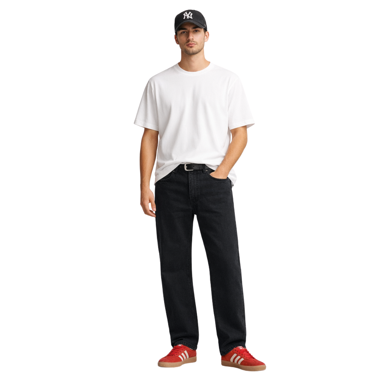
White tee + black straight-leg jeans + red low-top sneakers + Black baseball cap & belt. Simple. Timeless. Three colors.
Smart Casual
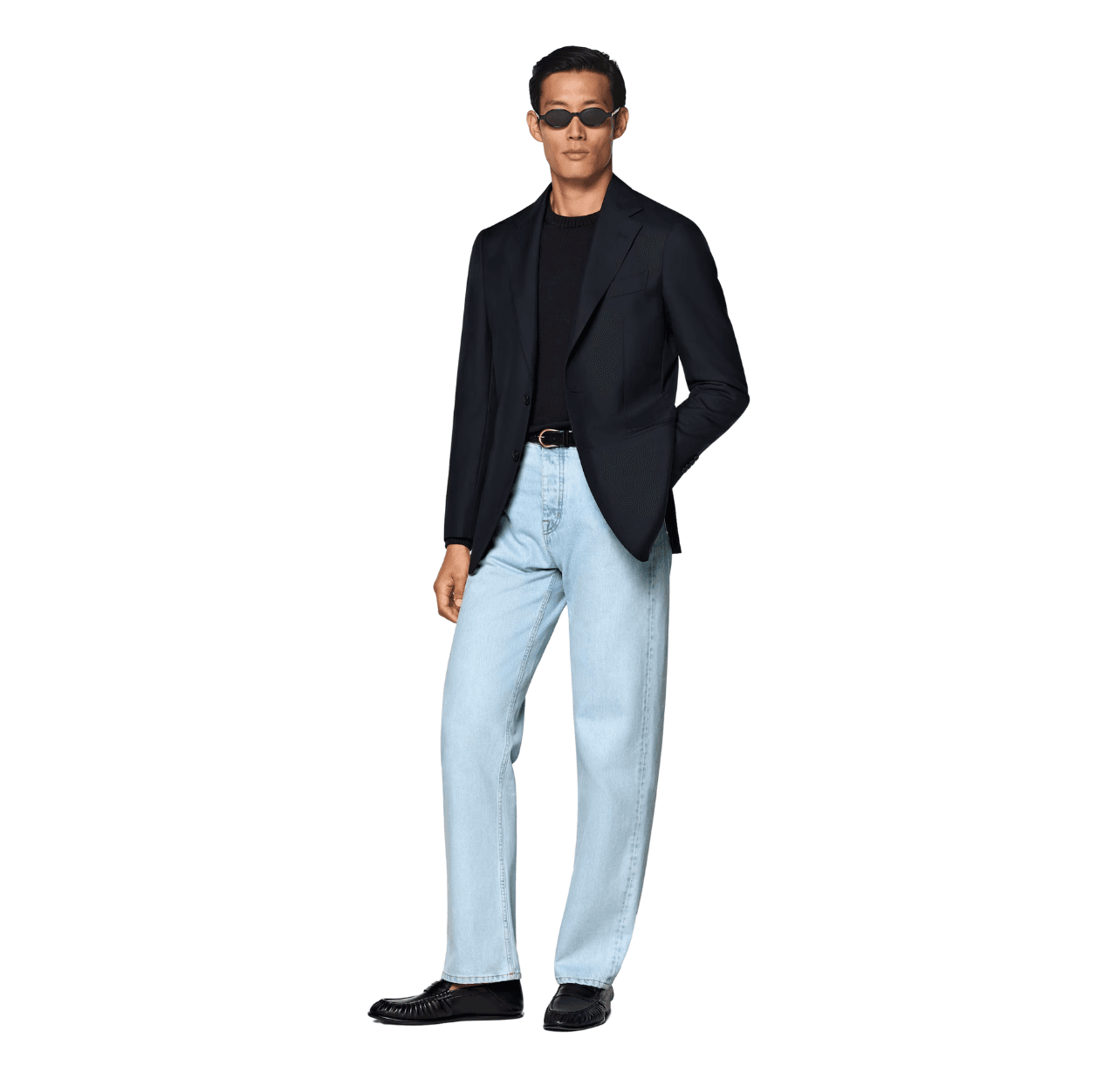
Navy blazer + light blue jeans + black slim crew neck sweater + black leather loafers, belt, and black sunglasses. Classic, versatile, works for dinners or casual Fridays.
Office / Business Casual
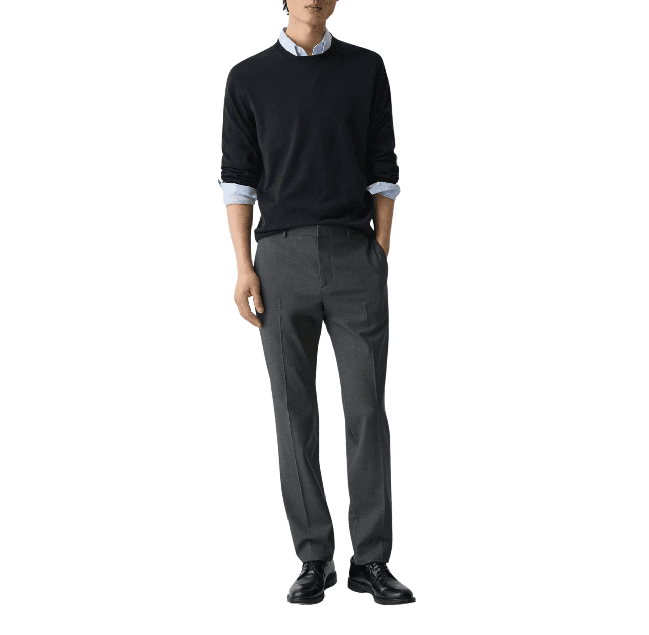
Light blue dress shirt + navy sweater + charcoal trousers + black leather shoes. Professional, clean, and completely within the three-color rules.
Date Night
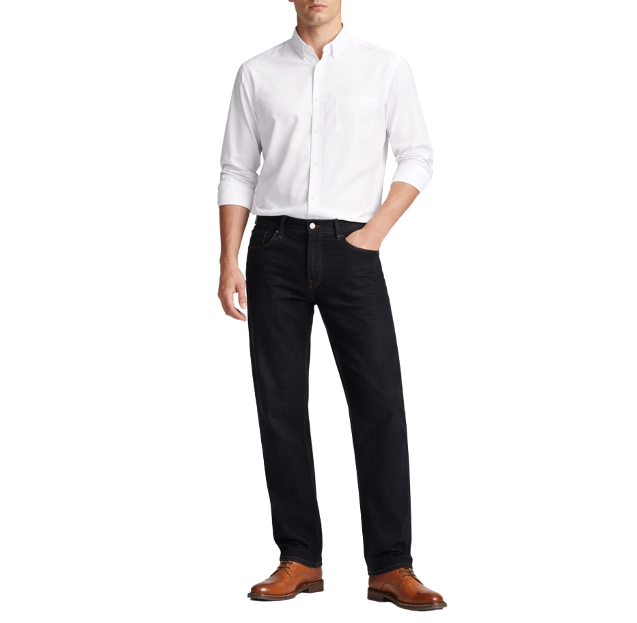
Black straight fit jeans + white fitted shirt + tan leather derbies. The neutral palette reads as confident and intentional — which is exactly the energy you want.
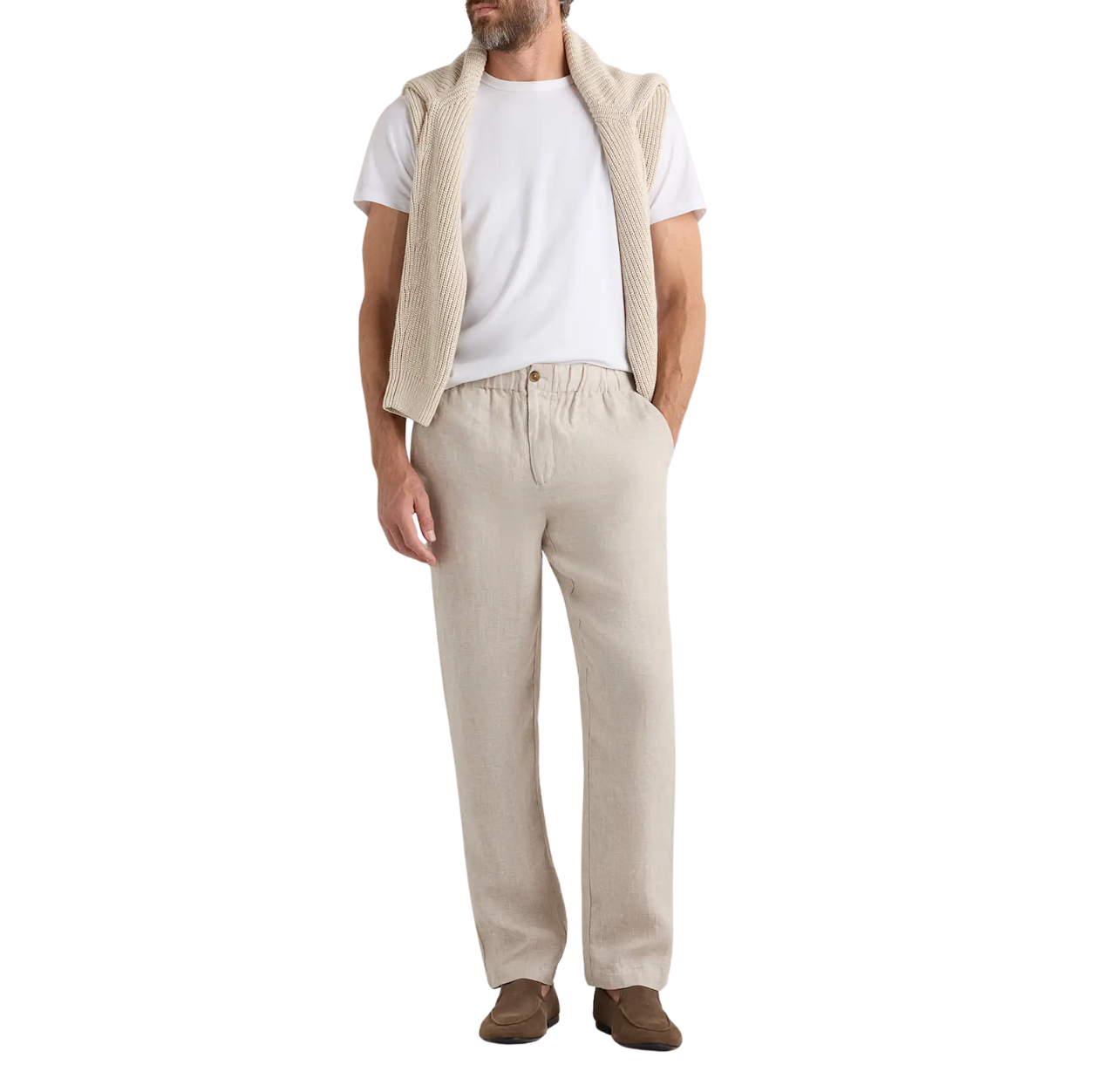
Travel
Beige linen trousers + white tee + brown slip-on loafers or sneakers. You can also add a beige sweater for the unexpected colds. Comfortable, packable, and always looks like you made an effort.
Frequently Asked Questions
Can I wear more than 3 colors?
Technically, yes.
That’s common in advanced styling approaches like intentional maximalism or color blocking.
But if you’re asking the question, you’re probably not yet at a point where you should add more colors to your outfit. Master the three-color system first. Break it later.
Do neutrals count as colors?
Yes.
I’ve seen people say neutrals don’t count. They do. But they’re easy to work with.
For example, white, black, and grey still count toward your three colors. The difference is that neutrals pair so naturally with each other that two neutral slots plus one accent color is almost a guaranteed formula for success.
Does denim count as a color?
Yes.
If you’re wearing a washed blue denim jacket over a light blue tee, that’s technically the same color family—blue.
If you add indigo blue jeans, you’re doubling up. That’s not a problem because the shades are clearly different, but in general, spread your colors across the outfit.
What if my shoes are a different color from the rest of my outfit?
That’s fine as long as they’re your third color, not a fourth.
For example, if you’re wearing a white tee + navy chinos + a light brown belt, chocolate-brown loafers fit perfectly.
But if you add bright red shoes to that outfit, that’s two accents competing for attention. Pick one.
Do patterns break the rule?
No.
Treat a patterned piece as one color slot.
Just make sure the tones in the pattern work with the rest of your outfit, and keep the overall palette at three. Also, keep the rest of your outfit simple and clean.
Is monochrome better than 3 colors?
Different, not necessarily better.
Monochrome outfits (one color, multiple shades) are incredibly sophisticated once you’re comfortable with them. But a well-done three-color outfit can be just as sharp and more visually dynamic.
Wrapping Up
The three-color rule isn’t a straitjacket. It’s a starting point.
Use it when you’re building your style. Use it when you’re in a rush. Use it when you want to look consistently good without overthinking every decision.
Pick a base. Add a secondary. Finish with an accent. Repeat colors for harmony. Check the mirror. Walk out the door.
That’s it. No complicated color wheels. No expensive style consultants. Just a simple framework that works.
And once you’ve got the rule locked in? Go ahead and break it. That’s when style starts getting really interesting.
Some of the links on this page are affiliate links. This means if you click and make a purchase, we may earn a small commission at no extra cost to you. We only recommend products we genuinely like and think you’ll enjoy.